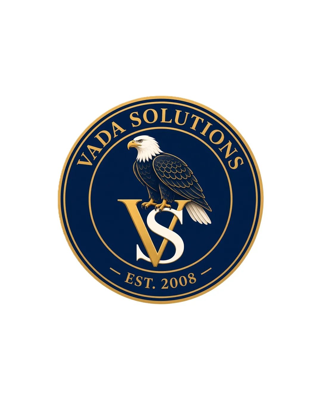
VADA SOLUTIONS EST. 2008 VS logo review
3.7/5
Logo score
Logo review of

Vada Solutions Est. 2008 Vs

Distinctive and authoritative emblem that effectively signals reliability, with refinement needed in monogram clarity and simplification for broader versatility.

Emblem Classic Heraldic Badge, Formal, Detailed Technology/cybersecurity
4/5
Legibility
3.5/5
Originality
5/5
Misread
4/5
Balance
3/5
Scale
Action plan

What to fix first

The most important fixes to handle before polishing the full presentation.

1

Simplify the eagle detail and VS monogram for small-scale applications or responsive versions

High priority

Detailed emblem risks loss of fidelity at minor reproduction sizes, affecting professional usability.

Impact: Improves Clarity And Versatility Across Digital And Print Media · Effort: Medium

2

Explore subtle tweaks to the VS monogram spacing/overlap

Medium priority

Current overlap is stylistic but slightly compromises instant readability, especially at a glance.

Impact: Enhances Legibility And Perceived Precision Of The Mark · Effort: Low

Detailed review

Logo performance breakdown

4/5

Legibility

Checkmark icon Primary text "VADA SOLUTIONS" and EST. 2008 are readable and clear
Checkmark icon VS monogram is distinguishable

Warning icon VS overlap reduces instant clarity at small sizes

3.5/5

Originality

Checkmark icon Classic eagle integration is visually appealing

Warning icon Eagle-on-badge motifs are traditional and moderately common in US-influenced branding

4/5

Color harmony

Checkmark icon Rich blue and gold palette fits the formal/security context
Checkmark icon Good contrast between elements

Warning icon Metallic gold effect could be less effective in flat or black-and-white uses

Blue
#22304D

Gold
#C9A345

White
#FFFFFF

Your palette is close. Refine the color roles and combinations before updating the logo.

Build brand colors
4/5

Balance alignment

Checkmark icon Central eagle and monogram provide hierarchy and optical balance
Checkmark icon Wordmark and badge rings are well centered

Warning icon Minor crowding around VS and eagle area

logo 200x250 pixels scalability test alignment grid overlay
3/5

Scalability

Checkmark icon Bold forms, strong contrast, consistent outline

Warning icon Detailed eagle illustration and small text within badge may lose clarity at small sizes
Warning icon Not optimized for simplified responsive reduction

logo 200x250 pixels scalability test

200x250 px

logo 100x125 pixels scalability test

100×125 px

logo 50x62 pixels scalability test

50×62 px

5/5

Misinterpretations

Checkmark icon No ambiguous or offensive secondary interpretations

4/5

Logo structure & brief match

Checkmark icon VS monogram, eagle, and type all share a coordinated classic style

Warning icon Slight visual tension between VS letterforms and eagle overlap

Checkmark icon Industry: Strongly aligned; eagle and badge connote trust and longevity suitable for IT, MSP, or cybersecurity.
Checkmark icon Values: Communicates authority, reliability, and tradition.

Try your own review

Wondering how your logo performs?

Get a clear logo score, key risks, and priority fix ideas before your client or audience sees it.

Review my logo