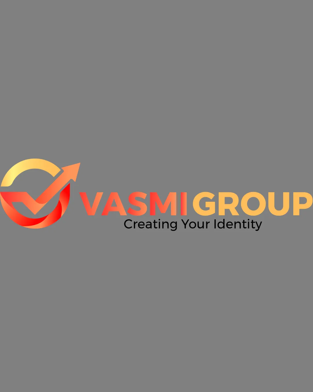
VASMI GROUP Creating Your Identity logo review
3/5
Logo score
Logo review of

Vasmi Group Creating Your Identity

Competent and visually coherent, but lacks distinctiveness required for a luxury, premium digital brand.

Combination Gradient Modern With Geometric Symbol Digital Marketing, IT Services
5/5
Legibility
2/5
Originality
5/5
Misread
3/5
Balance
3/5
Scale
Your next steps

What to fix first

Focus on the changes that matter. Keep what makes the logo work.

1

Standalone mark

Explore a more unique or stylized mark relating to digital identity or growth.

Visible issue High priority Medium effort
Area to inspectApproximate location

The checkmark-arrow in a circle is a common motif in digital and technology branding, reducing memorability.

How to check

Show sketches with distinctive takes on upward movement/state-of-the-art identity.

See the category review
2

Standalone mark

Test mark at smaller scales and in flat monochrome to ensure essential form holds up.

Visible issue Medium priority Low effort
Area to inspectApproximate location

Gradient detail and fine color transitions in the symbol may lose clarity at small sizes or on non-digital backgrounds.

How to check

Print and digitally reduce logo; supply a flat version if fine gradients hinder legibility.

See the category review
Detailed review

Logo performance breakdown

3/5

Brief & logo match

Based on your brief
Compared with

Digital Marketing & IT Services for businesses/professionals; luxury, modern, premium, professional image.

Delivers basic modern and professional appeal, but symbol lacks the distinctiveness to signal true luxury or memorable premium status.

  • Luxury/Premium Feel

    While gradients and warm hues add some premium appeal, the symbol's ubiquity limits luxury distinctiveness.

  • Modern IT/Marketing Identity

    Gradient color, arrow and checkmark evoke modern, digital-forward ethos for the service sector.

5/5

Legibility

  • All text is clean and readable.
2/5

Originality

  • Modern styling.
  • The checkmark-arrow in a circle is a common motif in digital and technology branding, reducing memorability.

    Visible issue Standalone mark

    Try: Explore a more unique or stylized mark relating to digital identity or growth.

    Check: Show sketches with distinctive takes on upward movement/state-of-the-art identity.
    Area to inspectApproximate location
4/5

Color harmony

  • Warm gradient evokes energy and positivity.
Yellow#FBBF37
Red#EB4F45
Orange#F29B33
Black#000000

Estimated colors. Use the original design file for exact values.

Create a full color palette using these colors

Create new palette
3/5

Balance alignment

  • Spacing is consistent; layout is orderly.
  • Slight imbalance between "VASMI" and "GROUP" due to different color weights and "GROUP" bolder due to yellow's brightness, making the right side visually heavier.

    Optional refinement wordmark

    Try: Adjust color brightness, contrast or font weight for balance between halves of the wordmark.

    Check: Test wordmark in grayscale and check visual balance.

Uploaded logoAlignment guide overlay

Inspect spacing with the guide. Optical balance may differ from geometric centering.

3/5

Scalability

  • Core symbol is simple, recognizable at moderate sizes.
  • Gradient detail and fine color transitions in the symbol may lose clarity at small sizes or on non-digital backgrounds.

    Visible issue Standalone mark

    Try: Test mark at smaller scales and in flat monochrome to ensure essential form holds up.

    Check: Print and digitally reduce logo; supply a flat version if fine gradients hinder legibility.

    Area to inspectApproximate location
Uploaded logo at 200 pixels wide
200 × 250 px
Uploaded logo at 100 pixels wide
100 × 125 px
Uploaded logo at 50 pixels wide
50 × 63 px

Compare the detail at different sizes. Labels show the full image dimensions.

5/5

Misinterpretations

  • No unintended negative shapes or misreadings.
3/5

Symbol & text fit

  • Symbol and wordmark are proportionally sized.
  • The mark and wordmark feel only loosely integrated; the visual flow from the symbol to name is basic.

    Optional refinement combination lockup

    Try: Consider subtle alignment or interaction between symbol and wordmark for a cohesive unit.

    Check: Experiment with mark placement or tie-ins to improve synergy.

Black & white

Does the shape still work without color?

These tests are available only for logos uploaded in vector (SVG) format.

Background contrast

Find the surfaces where your logo stays clear.

These tests are available only for logos uploaded in vector (SVG) format.

Blur & silhouette

A 3px blur softens fine details so you can check whether the overall shape stays recognizable. If key gaps close or elements merge, the logo may rely too heavily on detail.

These tests are available only for logos uploaded in vector (SVG) format.

Try your own review

Wondering how your logo performs?

Get a clear logo score, key risks, and priority fix ideas before your client or audience sees it.

Review my logo