Wondering how your logo performs? 🧐
Get professional logo reviews in seconds and catch design issues in time.
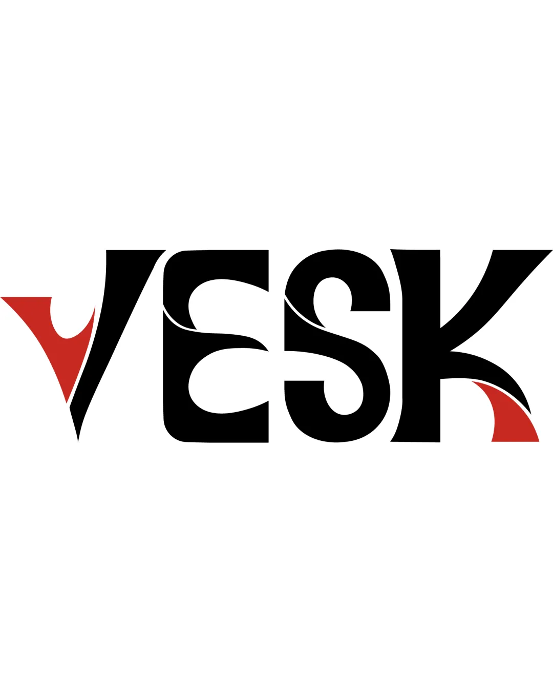
Try it Now!Logo review of VESK
 Logo analysis by AI
Logo type:
Style:
Detected symbol:
Negative space:
Detected text:
Business industry:
Review requested by Silfyy
**If AI can recognize or misinterpret it, so can people.
Structured logo review
Legibility
![]() Distinct separation between letters
Distinct separation between letters![]() Unique forms attract attention
Unique forms attract attention
![]() Heavy stylization in 'E' and 'S' hurts instant readability
Heavy stylization in 'E' and 'S' hurts instant readability![]() Abstract curves interfere with initial text recognition
Abstract curves interfere with initial text recognition
Scalability versatility
![]() Bold shapes help at larger scales like signage and billboards
Bold shapes help at larger scales like signage and billboards![]() Limited color palette aids in multiple applications
Limited color palette aids in multiple applications
![]() Fine negative space details may be lost in small-scale use (e.g., business cards, favicons)
Fine negative space details may be lost in small-scale use (e.g., business cards, favicons)![]() Complex shapes may reproduce poorly in embroidery or stamping
Complex shapes may reproduce poorly in embroidery or stamping
200x250 px
100×125 px
50×62 px
Balance alignment
![]() Consistent weight across all letterforms
Consistent weight across all letterforms![]() Cohesive integration of red accents keeps visual weight distributed
Cohesive integration of red accents keeps visual weight distributed
![]() The extended shapes of 'V' and 'K' slightly unbalance the horizontal rhythm
The extended shapes of 'V' and 'K' slightly unbalance the horizontal rhythm

Originality
![]() Creative custom typographic approach
Creative custom typographic approach![]() Red accent forms add unique flair
Red accent forms add unique flair
![]() Letterform manipulation style is modern but not radically distinct from other stylized wordmarks
Letterform manipulation style is modern but not radically distinct from other stylized wordmarks
Aesthetic look
![]() Striking high-contrast palette
Striking high-contrast palette![]() Modern, confident forms
Modern, confident forms
![]() Inner negative shapes may feel visually busy to some viewers
Inner negative shapes may feel visually busy to some viewers
Dual meaning and misinterpretations
![]() Abstract shapes enhance interest without suggesting inappropriate imagery
Abstract shapes enhance interest without suggesting inappropriate imagery
Color harmony
![]() Simple and effective two-tone palette
Simple and effective two-tone palette![]() Red accents provide energy without overwhelming the design
Red accents provide energy without overwhelming the design
Black
#000000
Red
#D13028


