Wondering how your logo performs? 🧐
Get professional logo reviews in seconds and catch design issues in time.
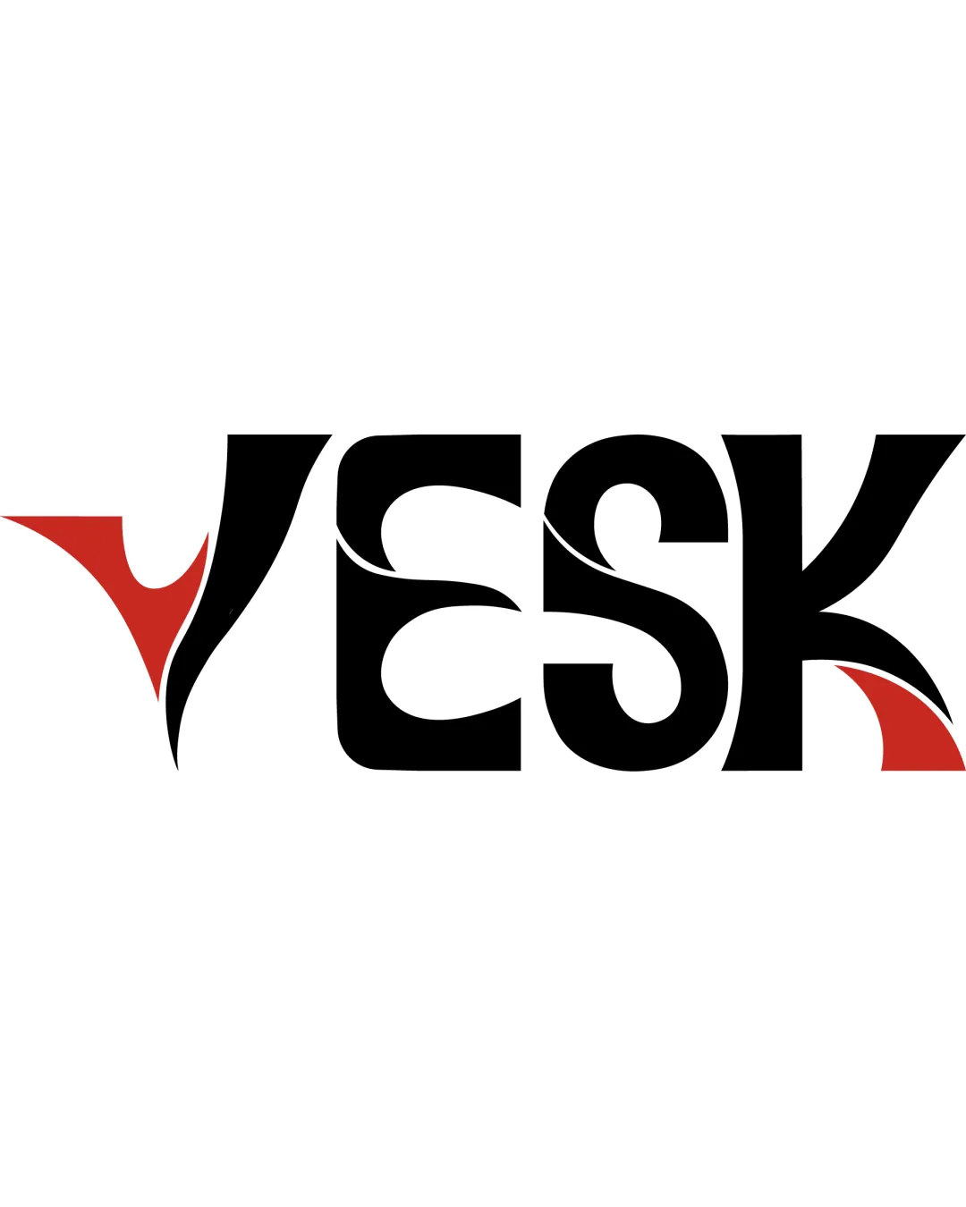
Try it Now!Logo review of VESK
 Logo analysis by AI
Logo type:
Style:
Detected symbol:
Negative space:
Detected text:
Business industry:
Review requested by Silfyy
**If AI can recognize or misinterpret it, so can people.
Structured logo review
Legibility
![]() All letters are technically distinguishable with examination
All letters are technically distinguishable with examination![]() High contrast between text and background
High contrast between text and background
![]() Abstract swoosh elements reduce immediate readability, especially at a glance
Abstract swoosh elements reduce immediate readability, especially at a glance![]() Letterforms, particularly 'V', 'S', and 'K', can appear ambiguous due to stylization
Letterforms, particularly 'V', 'S', and 'K', can appear ambiguous due to stylization
Scalability versatility
![]() Bold, thick letterforms help retain some clarity at small sizes
Bold, thick letterforms help retain some clarity at small sizes![]() Distinctive style could stand out on large-scale signage
Distinctive style could stand out on large-scale signage
![]() Fine details in swoosh elements may blur or lose impact at very small sizes (e.g., favicons, embroidery)
Fine details in swoosh elements may blur or lose impact at very small sizes (e.g., favicons, embroidery)![]() Complex internal shapes may create printing issues on limited-scale mediums like pens or business cards
Complex internal shapes may create printing issues on limited-scale mediums like pens or business cards
200x250 px
100×125 px
50×62 px
Balance alignment
![]() Wordmark feels visually anchored and weight is distributed evenly overall
Wordmark feels visually anchored and weight is distributed evenly overall![]() Swoosh elements are mirrored thoughtfully to create visual interest
Swoosh elements are mirrored thoughtfully to create visual interest
![]() Left side ('V') is more visually heavy due to large red swoosh, causing very slight asymmetry to the composition
Left side ('V') is more visually heavy due to large red swoosh, causing very slight asymmetry to the composition

Originality
![]() Custom, abstract integration of swoosh elements within letterforms is visually unique
Custom, abstract integration of swoosh elements within letterforms is visually unique![]() Combination of color and negative space within letters adds distinctiveness
Combination of color and negative space within letters adds distinctiveness
![]() Swoosh motifs are somewhat common in dynamic/tech branding, slightly reducing originality
Swoosh motifs are somewhat common in dynamic/tech branding, slightly reducing originality
Aesthetic look
![]() Modern and energetic mood conveyed via flowing lines and bold contrast
Modern and energetic mood conveyed via flowing lines and bold contrast![]() Minimalist color palette enhances sophistication
Minimalist color palette enhances sophistication
![]() Multiple swoosh elements risk making the composition feel busy, especially in small applications
Multiple swoosh elements risk making the composition feel busy, especially in small applications![]() Stylistic choices create minor visual noise around letterforms
Stylistic choices create minor visual noise around letterforms
Dual meaning and misinterpretations
![]() No inappropriate or unintended dual meanings detected
No inappropriate or unintended dual meanings detected![]() Abstract forms communicate energy without negative connotations
Abstract forms communicate energy without negative connotations
Color harmony
![]() Two-color scheme (black and red) offers strong contrast and effective visual hierarchy
Two-color scheme (black and red) offers strong contrast and effective visual hierarchy![]() Red accents draw attention without overwhelming the composition
Red accents draw attention without overwhelming the composition
Black
#000000
Cinnabar
#D02B19
White
#FFFFFF


