Vezér Optika logo review
4/5
Logo score Combination category

Vezér Optika

creative913023 Essential logo review

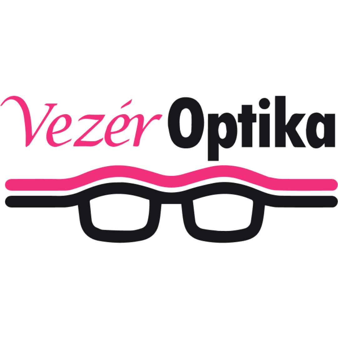
A strong and inviting optometry logo, with well-matched symbol and name, but minor refinements in text style balance and small-scale clarity will strengthen it further.

Symbols recognized:
Stylized eyeglasses with parallel pink and black lines forming the arms and bridge, supported by bold and script wordmark above.
Legible text:
Vezér Optika
Combination Modern, Approachable, Optometry-themed Optometry/eyewear
5/5
Legibility
4/5
Originality
3/5
Balance
3/5
Scale
Your next steps

What to fix first

Focus on the changes that matter. Keep what makes the logo work.

What to preserve

A clear, accessible optometry logo combining a script and bold sans-serif wordmark with a glasses-themed mark, expressing both professionalism and approachability.

Spelling & grammar

No obvious issue found

The wordmark is clearly readable; no spelling issues detected.
1

Standalone mark (eyeglasses symbol)

Test the mark at small scale and increase minimum line weight if legibility is affected.

High priority Visible issue Low effort

Thin lines in the eyeglasses symbol may reduce clarity at very small sizes, especially the pink line.

See the category review
2

wordmark

Refine wordmark harmony, considering either moderating the contrast between script and bold or improving alignment between text elements.

Medium priority Optional refinement Medium effort

The 'Vezér' script and 'Optika' bold text have differing weights and styles, causing a mild visual tension between them.

See the category review
Detailed review

Logo performance breakdown

5/5

Brief & logo match

The logo convincingly expresses a personalized, vision-focused brand with its glasses icon and welcoming style.

5/5

Legibility

  • Wordmark is highly readable.
4/5

Originality

  • Glasses motif is integrated with clean, distinctive text styling.
4/5

Color harmony

  • Pink and black provide lively, friendly contrast.
Pink#FF4094
Black#000000

Estimated colors. Use the original design file for exact values.

Create a full color palette using these colors

Create new palette
3/5

Balance alignment

  • Distinctive wordmark pairing.
  • The 'Vezér' script and 'Optika' bold text have differing weights and styles, causing a mild visual tension between them.

    Optional refinement wordmark

    Try: Refine wordmark harmony, considering either moderating the contrast between script and bold or improving alignment between text elements.

Uploaded logoAlignment guide overlay

Inspect spacing with the guide. Optical balance may differ from geometric centering.

3/5

Scalability

  • Eyeglasses icon is clear at medium/large sizes.
  • Thin lines in the eyeglasses symbol may reduce clarity at very small sizes, especially the pink line.

    Visible issue Standalone mark (eyeglasses symbol)

    Try: Test the mark at small scale and increase minimum line weight if legibility is affected.

5/5

Misinterpretations

  • No unintended readings detected.
4/5

Symbol & text fit

  • The glasses icon matches the eyewear context and wordmark.
Try your own review

Wondering how your logo performs?

Get a clear logo score, key risks, and priority fix ideas before your client or audience sees it.

Review my logo