 View review
Logo score
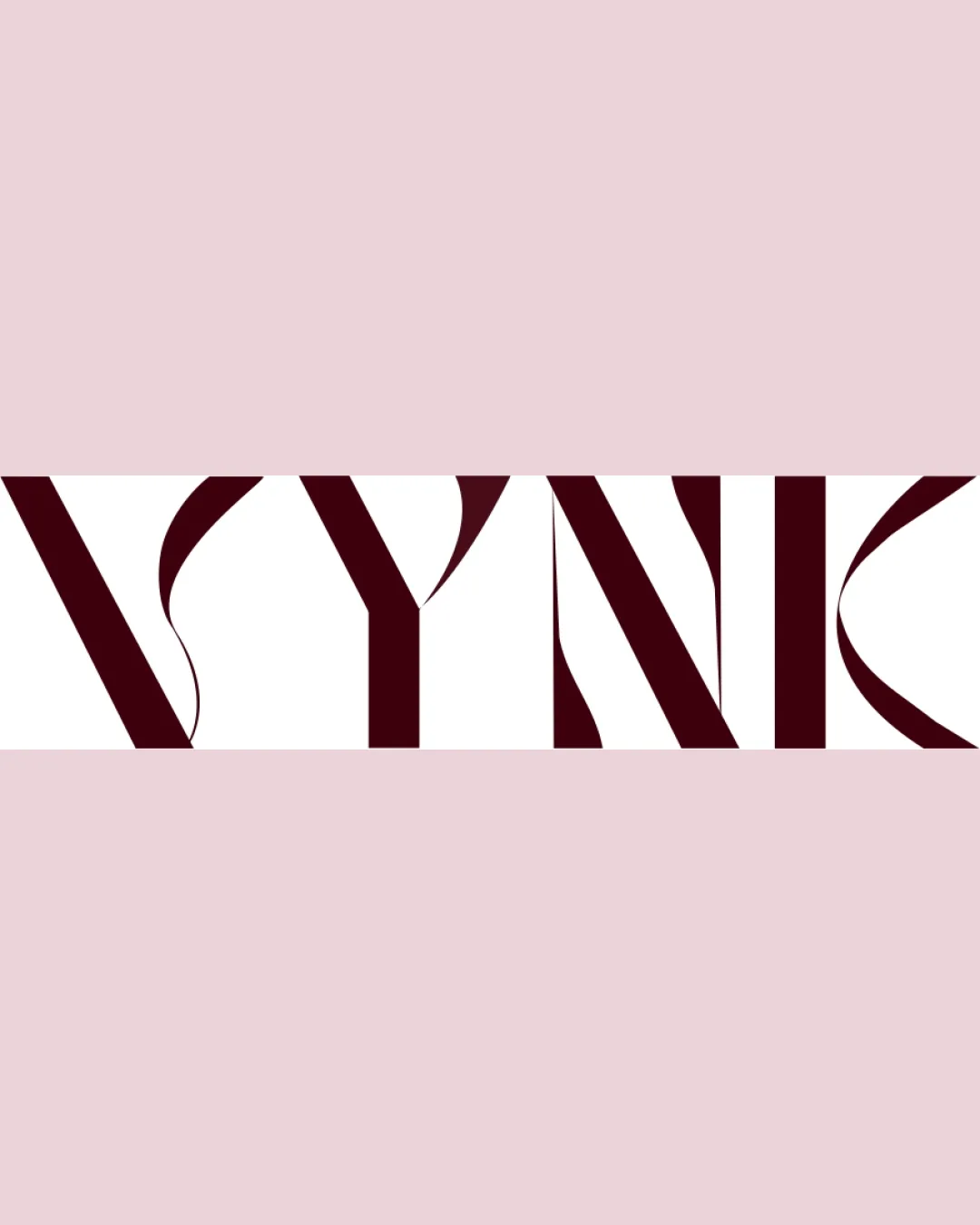
Logo review ofVynk
Review the detailed scores below to see what is working and what should be refined first.
Legibility
Originality
Misread
Balance
Scale
Detailed review
Logo performance breakdown
Legibility
![]() Letterforms are bold and eye-catching.
Letterforms are bold and eye-catching.![]() The spacing between letters creates a strong visual presence.
The spacing between letters creates a strong visual presence.
![]() Legibility is compromised—the abstract cuts and exaggerated contrast obscure the letterforms, making the word difficult to read at first glance.
Legibility is compromised—the abstract cuts and exaggerated contrast obscure the letterforms, making the word difficult to read at first glance.![]() The unique forms may confuse viewers unfamiliar with the brand.
The unique forms may confuse viewers unfamiliar with the brand.
Originality
![]() Custom, stylized type treatment with high contrast and artistic flair.
Custom, stylized type treatment with high contrast and artistic flair.![]() The serif alternation and cutaways create a unique interpretation uncommon in generic wordmarks.
The serif alternation and cutaways create a unique interpretation uncommon in generic wordmarks.
![]() While distinctive, the visual approach is not wholly new—similar extremes in contrast have appeared among luxury and high-fashion brands. Still, the composition feels fresh for many sectors.
While distinctive, the visual approach is not wholly new—similar extremes in contrast have appeared among luxury and high-fashion brands. Still, the composition feels fresh for many sectors.
Color harmony
![]() Elegant use of burgundy against pale pink; high contrast with white provides an upscale look.
Elegant use of burgundy against pale pink; high contrast with white provides an upscale look.![]() Limited and harmonious palette.
Limited and harmonious palette.
Burgundy
#4B0A16
Pale Pink
#F2D4DB
White
#FFFFFF
Balance alignment
![]() The geometric structure is visually aligned across the baseline.
The geometric structure is visually aligned across the baseline.![]() Symmetry between the first and last letters creates a visually pleasing frame.
Symmetry between the first and last letters creates a visually pleasing frame.
![]() The exaggerated thicks and thins in the letterforms create a slightly uneven rhythm, especially on quick viewing.
The exaggerated thicks and thins in the letterforms create a slightly uneven rhythm, especially on quick viewing.

Scalability
![]() Strong shapes may work at large scale (billboards, store signage).
Strong shapes may work at large scale (billboards, store signage).
![]() Thin hairlines and intricate cuts risk disappearing or merging at small sizes (business cards, mobile screens, embroidery).
Thin hairlines and intricate cuts risk disappearing or merging at small sizes (business cards, mobile screens, embroidery).![]() The design loses clarity and legibility at reduced sizes, harming versatility for smaller applications.
The design loses clarity and legibility at reduced sizes, harming versatility for smaller applications.
200x250 px
100×125 px
50×62 px
Misinterpretations
![]() No inappropriate dual meanings or negative visual associations detected.
No inappropriate dual meanings or negative visual associations detected.
Try your own review
Review my logo
Wondering how your logo performs?
Get a clear logo score, key risks, and priority fix ideas before your client or audience sees it.
Keep exploring


