 View review
Logo score
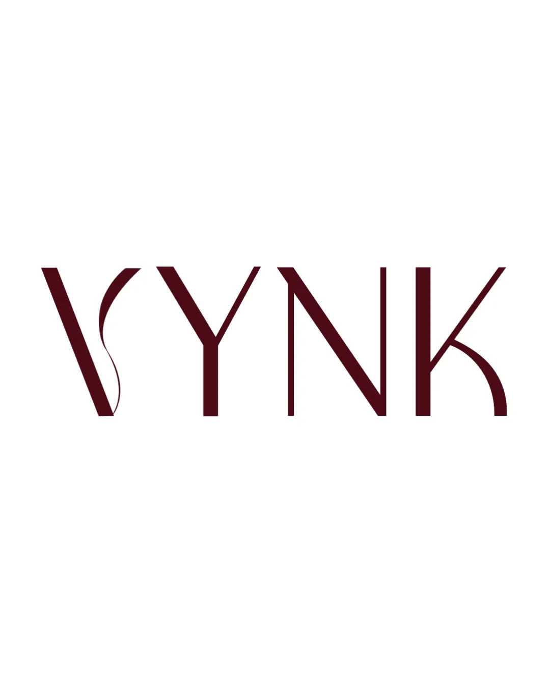
Logo review ofVynk
Review the detailed scores below to see what is working and what should be refined first.
Legibility
Originality
Misread
Balance
Scale
Detailed review
Logo performance breakdown
Legibility
![]() The letters are mostly recognizable and clear at standard viewing sizes.
The letters are mostly recognizable and clear at standard viewing sizes.![]() Contrast between the letterforms and the background is high, aiding readability.
Contrast between the letterforms and the background is high, aiding readability.
![]() The highly stylized 'V' and 'K' may reduce quick readability, especially at small sizes.
The highly stylized 'V' and 'K' may reduce quick readability, especially at small sizes.![]() The thin, curving stroke within the 'V' impairs immediate recognition of the letter form.
The thin, curving stroke within the 'V' impairs immediate recognition of the letter form.
Originality
![]() The integrated curve in the 'V' adds a unique, recognizable detail to a minimal wordmark.
The integrated curve in the 'V' adds a unique, recognizable detail to a minimal wordmark.![]() Custom manipulation of letterforms gives a distinct character not typically found in standard fonts.
Custom manipulation of letterforms gives a distinct character not typically found in standard fonts.
![]() Outside the unique 'V', other letters are less distinctive and verge on generic geometric sans-serif.
Outside the unique 'V', other letters are less distinctive and verge on generic geometric sans-serif.
Color harmony
![]() Single, deep maroon color creates harmony and supports high-contrast legibility.
Single, deep maroon color creates harmony and supports high-contrast legibility.![]() Restrained palette reinforces minimal and chic aesthetic.
Restrained palette reinforces minimal and chic aesthetic.
Bordeaux
#5A161B
White
#FFFFFF
Balance alignment
![]() Overall letter spacing is even and vertical alignment is consistent.
Overall letter spacing is even and vertical alignment is consistent.![]() The balance of line weight from left to right is cohesive.
The balance of line weight from left to right is cohesive.
![]() The internal curve within the 'V' makes that area feel slightly heavier and less balanced compared to the geometric simplicity of the other letters.
The internal curve within the 'V' makes that area feel slightly heavier and less balanced compared to the geometric simplicity of the other letters.![]() Curved terminals on 'K' and the inner leg of the 'Y' create minor inconsistencies in flow.
Curved terminals on 'K' and the inner leg of the 'Y' create minor inconsistencies in flow.

Scalability
![]() Simple color palette supports solid reproduction on various mediums.
Simple color palette supports solid reproduction on various mediums.![]() Clean wordmark style ensures reasonable adaptability to horizontal applications such as website headers and product packaging.
Clean wordmark style ensures reasonable adaptability to horizontal applications such as website headers and product packaging.
![]() Thin strokes, particularly the curving internal line in the 'V', risk disappearing at small sizes or in embroidery.
Thin strokes, particularly the curving internal line in the 'V', risk disappearing at small sizes or in embroidery.![]() Distinctive letter styling may lose definition as a favicon or on very small business cards.
Distinctive letter styling may lose definition as a favicon or on very small business cards.
200x250 px
100×125 px
50×62 px
Misinterpretations
![]() No inappropriate or ambiguous secondary imagery detected in these letterforms.
No inappropriate or ambiguous secondary imagery detected in these letterforms.
Try your own review
Review my logo
Wondering how your logo performs?
Get a clear logo score, key risks, and priority fix ideas before your client or audience sees it.
Keep exploring


