Wondering how your logo performs? 🧐
Get professional logo reviews in seconds and catch design issues in time.
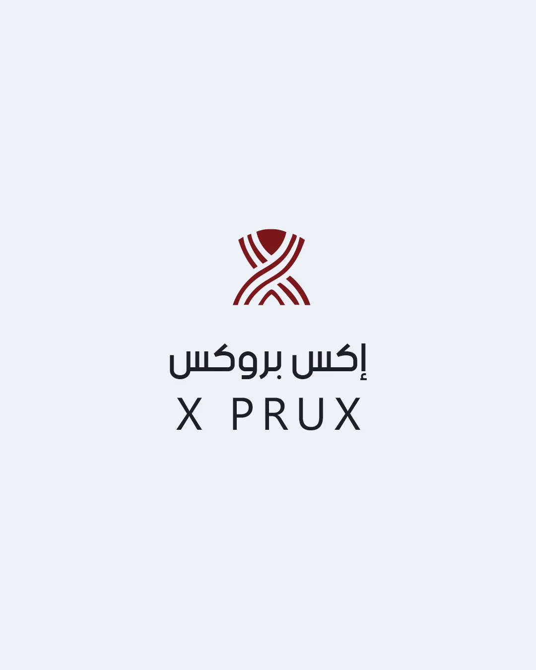
Try it Now!Logo review of إكس بروكس X PRUX
 Logo analysis by AI
Logo type:
Style:
Detected symbol:
Negative space:
Detected text:
Business industry:
Review requested by Nj_des
**If AI can recognize or misinterpret it, so can people.
Structured logo review
Legibility
![]() Latin and Arabic text are both highly readable and spaced well.
Latin and Arabic text are both highly readable and spaced well.![]() Font choice is modern and clean without unnecessary decoration.
Font choice is modern and clean without unnecessary decoration.
Scalability versatility
![]() Logo mark is simple enough to scale down for smaller applications like favicons.
Logo mark is simple enough to scale down for smaller applications like favicons.![]() Works well for digital and print applications, such as signage, websites, and business cards.
Works well for digital and print applications, such as signage, websites, and business cards.
![]() Fine line work in the symbol may lose some clarity at extremely small sizes, such as embroidery or tiny promotional items.
Fine line work in the symbol may lose some clarity at extremely small sizes, such as embroidery or tiny promotional items.![]() Gradient thickness in the lines could become muddled in monotone applications.
Gradient thickness in the lines could become muddled in monotone applications.
200x250 px
100×125 px
50×62 px
Balance alignment
![]() Logo mark is centered above the text, creating a sense of vertical harmony.
Logo mark is centered above the text, creating a sense of vertical harmony.![]() Both Latin and Arabic text are aligned for an aesthetically balanced composition.
Both Latin and Arabic text are aligned for an aesthetically balanced composition.

Originality
![]() Intertwined 'X' mark is unique and has a visually dynamic quality.
Intertwined 'X' mark is unique and has a visually dynamic quality.![]() Utilizes abstract geometric forms, moving away from generic icons.
Utilizes abstract geometric forms, moving away from generic icons.
![]() The mark is still somewhat reminiscent of common 'network' or 'connection' icons seen in tech branding, slightly reducing originality.
The mark is still somewhat reminiscent of common 'network' or 'connection' icons seen in tech branding, slightly reducing originality.
Logomark wordmark fit
![]() Stylized geometric mark complements the modern, clean font of the wordmark.
Stylized geometric mark complements the modern, clean font of the wordmark.![]() Consistent use of color and weight between text and symbol ties elements together effectively.
Consistent use of color and weight between text and symbol ties elements together effectively.
Aesthetic look
![]() Understated color palette and simplicity create a modern, professional look.
Understated color palette and simplicity create a modern, professional look.![]() Visual rhythm in the mark adds interest without clutter.
Visual rhythm in the mark adds interest without clutter.
![]() Minimalism risks feeling slightly generic if not paired with strong brand collateral.
Minimalism risks feeling slightly generic if not paired with strong brand collateral.
Dual meaning and misinterpretations
![]() No inappropriate or confusing dual meanings detected.
No inappropriate or confusing dual meanings detected.![]() Mark is abstract enough to avoid accidental misinterpretation.
Mark is abstract enough to avoid accidental misinterpretation.
Color harmony
![]() Limited to two main colors plus a subtle background, ensuring strong harmony.
Limited to two main colors plus a subtle background, ensuring strong harmony.![]() Contrast between the dark symbol/text and light background makes elements pop.
Contrast between the dark symbol/text and light background makes elements pop.
Dark Red
#6B2326
Dark Gray
#222223
Light Gray Background
#E3E8ED