Wondering how your logo performs? 🧐
Get professional logo reviews in seconds and catch design issues in time.
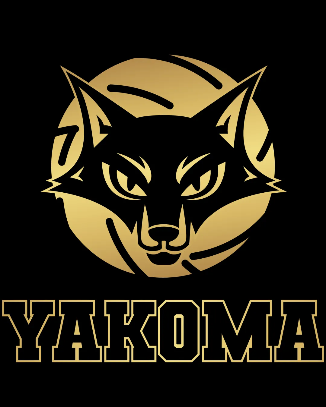
Try it Now!Logo review of YAKOMA
 Logo analysis by AI
Logo type:
Style:
Detected symbol:
Negative space:
Detected text:
Business industry:
Review requested by Daze2d
**If AI can recognize or misinterpret it, so can people.
Structured logo review
Legibility
![]() Text 'YAKOMA' is highly legible, with excellent contrast against the black background
Text 'YAKOMA' is highly legible, with excellent contrast against the black background![]() Typeface is bold and eye-catching, perfect for team branding
Typeface is bold and eye-catching, perfect for team branding
Scalability versatility
![]() Bold lines and simple forms ensure legibility at medium to large sizes
Bold lines and simple forms ensure legibility at medium to large sizes![]() Mascot and bold text are suitable for apparel, signage, and digital graphics
Mascot and bold text are suitable for apparel, signage, and digital graphics
![]() Detailed facial linework may lose clarity at small scales (favicons, small embroidery)
Detailed facial linework may lose clarity at small scales (favicons, small embroidery)![]() Metallic gradient effects may not reproduce well in all print or monochrome applications
Metallic gradient effects may not reproduce well in all print or monochrome applications
200x250 px
100×125 px
50×62 px
Balance alignment
![]() Strong symmetrical composition between the wolf’s head and the circle provides visual stability
Strong symmetrical composition between the wolf’s head and the circle provides visual stability![]() Wordmark is well-aligned beneath the mascot, achieving a cohesive and powerful look
Wordmark is well-aligned beneath the mascot, achieving a cohesive and powerful look

Originality
![]() Wolf head has unique stylization, especially with line details and circular framing
Wolf head has unique stylization, especially with line details and circular framing
![]() Wolf mascots and bold collegiate typefaces are common in sports branding; design does not break new ground conceptually
Wolf mascots and bold collegiate typefaces are common in sports branding; design does not break new ground conceptually
Logomark wordmark fit
![]() Logomark and wordmark share a consistent bold, strong visual style
Logomark and wordmark share a consistent bold, strong visual style![]() Color palette and outlines are matched across both components
Color palette and outlines are matched across both components
Aesthetic look
![]() Visually impactful and professional appearance
Visually impactful and professional appearance![]() Color gradient adds depth without excessive decoration
Color gradient adds depth without excessive decoration
![]() Slightly busy due to internal line detailing on wolf's face
Slightly busy due to internal line detailing on wolf's face
Dual meaning and misinterpretations
![]() Clear intended symbolism with no inappropriate double meanings
Clear intended symbolism with no inappropriate double meanings
Color harmony
![]() Consistent use of metallic gold and black creates a unified and striking effect
Consistent use of metallic gold and black creates a unified and striking effect
metallic gold
#D4AF37
black
#000000


