YAQEEN logo review
4/5
Logo score
Logo review of

Yaqeen

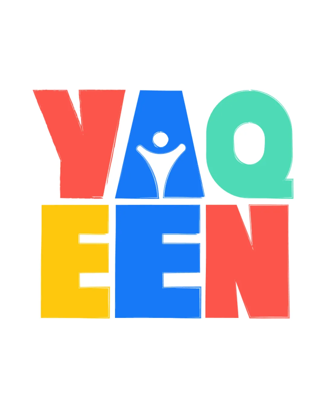
Bold, playful and energetic, with a distinctive concept but some refinement needed for polish and scalability.

Wordmark Blocky, Playful, Geometric
5/5
Legibility
4/5
Originality
5/5
Misread
3/5
Balance
3/5
Scale
Your next steps

What to fix first

Focus on the changes that matter. Keep what makes the logo work.

1

whole wordmark

Refine letterform proportions and alignment for more visual consistency.

Optional refinement Medium priority Medium effort

Letterforms vary in width and alignment, creating some visual imbalance, particularly with the top 'Q' feeling lighter than other blocks.

How to check

View as a block to ensure even color weight and visual anchors across the set.
See the category review
2

person in 'A'

Test logo at small scales and consider simplifying figure detail.

Worth testing Medium priority Low effort
Area to inspectApproximate location

The small human figure in the 'A' may lose definition at very small sizes.

How to check

Reduce size to check clarity of the figure in the 'A'.

See the category review
Detailed review

Logo performance breakdown

Not scored

Brief & logo match

More context needed

There isn't enough brand context to assess the match.

5/5

Legibility

  • Large, clear letterforms and strong color separation
4/5

Originality

  • Human figure in 'A' is clever and memorable
  • Block letter treatment is common; the unique human-in-'A' integration is a stronger originality point than the color-block layout.

    Optional refinement whole logo

    Try: Emphasize or iterate further on the custom integration/concept beyond blocky letter structure.

    Check: Compare with similar playful block lettermarks to highlight unique elements.

4/5

Color harmony

  • Vibrant, distinct palette adds energy
Red#F95F5C
Teal#23D5C1
Yellow#FFD600
Blue#247CFE

Estimated colors. Use the original design file for exact values.

Create a full color palette using these colors

Create new palette
3/5

Balance alignment

  • High-impact grid structure; playful irregularity
  • Letterforms vary in width and alignment, creating some visual imbalance, particularly with the top 'Q' feeling lighter than other blocks.

    Optional refinement whole wordmark

    Try: Refine letterform proportions and alignment for more visual consistency.

    Check: View as a block to ensure even color weight and visual anchors across the set.

Uploaded logoAlignment guide overlay

Inspect spacing with the guide. Optical balance may differ from geometric centering.

3/5

Scalability

  • Bold shapes generally scale well
  • The small human figure in the 'A' may lose definition at very small sizes.

    Worth testing person in 'A'

    Try: Test logo at small scales and consider simplifying figure detail.

    Check: Reduce size to check clarity of the figure in the 'A'.

    Area to inspectApproximate location
Uploaded logo at 200 pixels wide
200 × 250 px
Uploaded logo at 100 pixels wide
100 × 125 px
Uploaded logo at 50 pixels wide
50 × 63 px

Compare the detail at different sizes. Labels show the full image dimensions.

5/5

Misinterpretations

Black & white

Does the shape still work without color?

Preparing artwork...

Background contrast

Find the surfaces where your logo stays clear.

Compare the mark and lettering on each surface.

Blur & silhouette

A 3px blur softens fine details so you can check whether the overall shape stays recognizable. If key gaps close or elements merge, the logo may rely too heavily on detail.

Original
3px blur

Look for clear separation between shapes and a distinctive outline.

Try your own review

Wondering how your logo performs?

Get a clear logo score, key risks, and priority fix ideas before your client or audience sees it.

Review my logo