Wondering how your logo performs? 🧐
Get professional logo reviews in seconds and catch design issues in time.
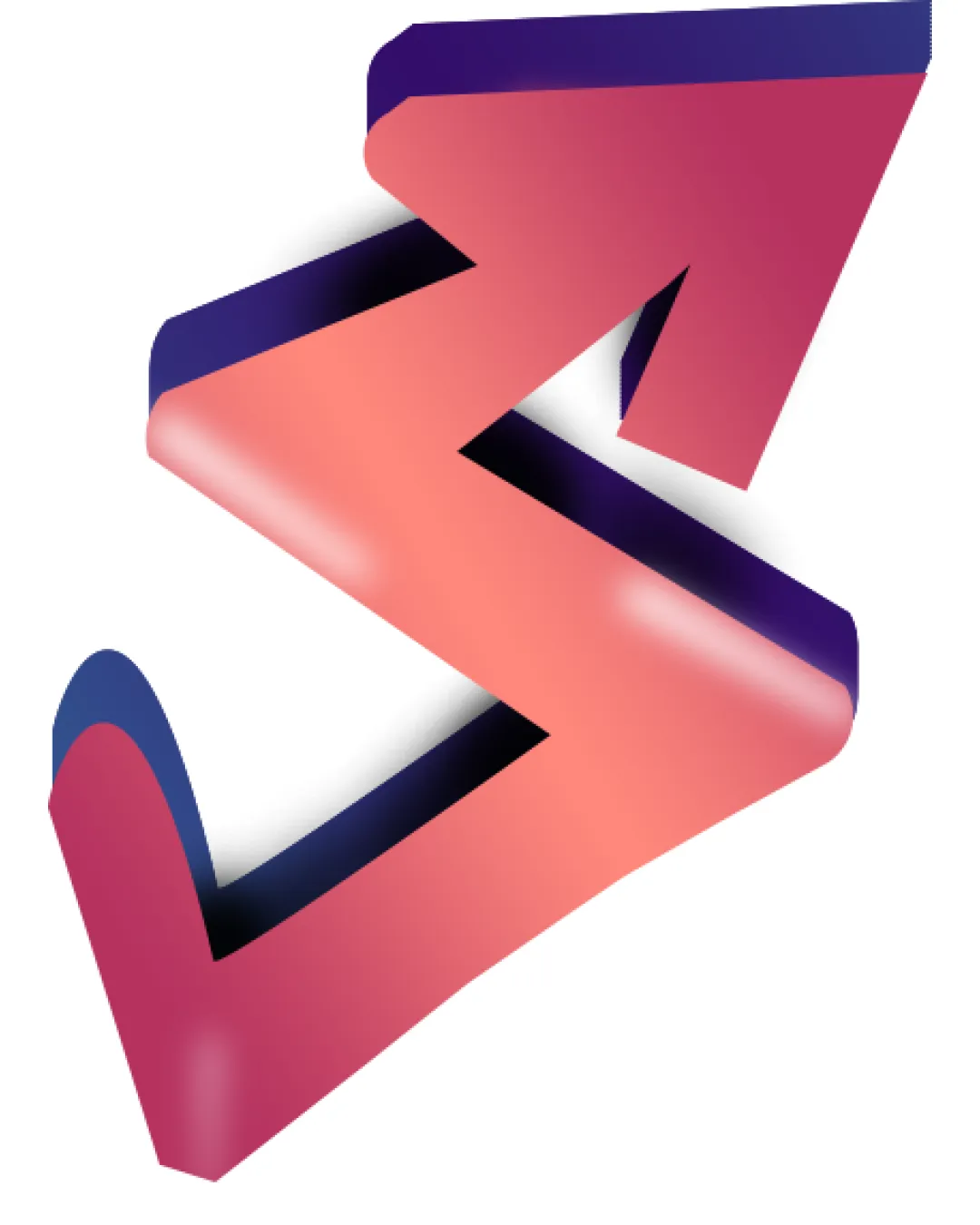
Try it Now!Logo review of zigzag ribbon forming an upward arrow
 Logo analysis by AI
Logo type:
Style:
Detected symbol:
Business industry:
Review requested by Simartwrld
**If AI can recognize or misinterpret it, so can people.
Structured logo review
Scalability versatility
![]() Bold geometric form retains shape at medium sizes.
Bold geometric form retains shape at medium sizes.![]() Distinct outline helps on large surfaces like billboards or banners.
Distinct outline helps on large surfaces like billboards or banners.
![]() Gradient and shadow effects limit clarity at small sizes such as app icons or embroidery.
Gradient and shadow effects limit clarity at small sizes such as app icons or embroidery.![]() Smoothness and color transitions will get lost in black-and-white formats and micro applications.
Smoothness and color transitions will get lost in black-and-white formats and micro applications.
200x250 px
100×125 px
50×62 px
Balance alignment
![]() Arrow shape is balanced overall.
Arrow shape is balanced overall.![]() Ribbon curves and negative spaces are relatively well distributed.
Ribbon curves and negative spaces are relatively well distributed.
![]() Slight heaviness in the top-right arrow portion makes it visually top-heavy, which could be improved for better balance.
Slight heaviness in the top-right arrow portion makes it visually top-heavy, which could be improved for better balance.

Originality
![]() 3D ribbon style adds a slight sense of depth and movement.
3D ribbon style adds a slight sense of depth and movement.![]() The approach is somewhat fresh for an arrow symbol.
The approach is somewhat fresh for an arrow symbol.
![]() Arrow motifs are extremely common in tech and growth-related logos, rendering the core concept generic.
Arrow motifs are extremely common in tech and growth-related logos, rendering the core concept generic.![]() No unique twist to set it apart from most upward-arrows used by startups and tech companies.
No unique twist to set it apart from most upward-arrows used by startups and tech companies.
Aesthetic look
![]() Gradient color palette gives the logo a modern, somewhat vibrant look.
Gradient color palette gives the logo a modern, somewhat vibrant look.![]() Soft corners and shadows add a touch of dimensionality.
Soft corners and shadows add a touch of dimensionality.
![]() Gradient is somewhat harsh and overused, creating a less timeless appearance.
Gradient is somewhat harsh and overused, creating a less timeless appearance.![]() The shiny, 3D look may quickly feel outdated as flat design continues to trend.
The shiny, 3D look may quickly feel outdated as flat design continues to trend.![]() The effect makes the logo look busy rather than clean and sharp.
The effect makes the logo look busy rather than clean and sharp.
Dual meaning and misinterpretations
![]() No inappropriate dual meanings or offensive symbols detected.
No inappropriate dual meanings or offensive symbols detected.
Color harmony
![]() Limited color palette with cohesive gradient transitions.
Limited color palette with cohesive gradient transitions.![]() Good contrast between pinks and deep purples.
Good contrast between pinks and deep purples.
![]() Gradient transitions may not translate well to all mediums, especially print or monochrome environments.
Gradient transitions may not translate well to all mediums, especially print or monochrome environments.
Persian Pink
#E86D72
Midnight Purple
#492B6D
Light Peach
#FFD1C0