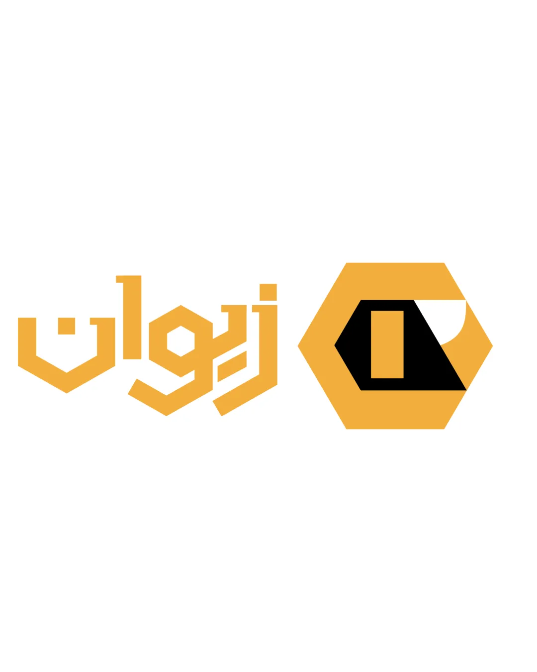
زوار ZWAR logo review
4.3/5
Logo score
Logo review of

زوار Zwar

A strong, professional combination mark that effectively expresses inclusivity, modernity, and cross-cultural engagement.

Combination Mark Modern, Geometric, Multilingual Events Or Multicultural Community
4.5/5
Legibility
4/5
Originality
5/5
Misread
4/5
Balance
4/5
Scale
Action plan

What to fix first

The most important fixes to handle before polishing the full presentation.

1

Slightly strengthen the weight or density of the circular mark, or slightly reduce wordmark thickness, to achieve a more balanced visual hierarchy.

Medium priority

The current mark can appear light compared to the strong wordmark, especially in large uses.

Impact: Creates Better Balance Between Mark And Wordmark Across Sizes. · Effort: Low

Detailed review

Logo performance breakdown

4.5/5

Legibility

Checkmark icon Both Arabic and Latin text are bold and highly readable; strong typeface contrast.

Warning icon Minor: Slight gap in scale between symbol and wordmark—wordmark may dominate at small sizes.

4/5

Originality

Checkmark icon Multicolored segmented circle is distinctive; dual-script approach is not generic.

Warning icon Circular multicolor marks are not wholly unique in global branding.

4.5/5

Color harmony

Checkmark icon Bright, clear, and well-coordinated palette across the spectrum. Color transitions support the message of diversity.

Warning icon Color use may be less flexible on dark backgrounds.

Red
#E53935

Green
#43A047

Yellow
#FBC02D

Blue
#3949AB

Brown
#6D4C41

Black
#000000

Your palette is close. Refine the color roles and combinations before updating the logo.

Build brand colors
4/5

Balance alignment

Checkmark icon Well-aligned text and symbol; pleasing proportion between mark and wordmark.

Warning icon Slight visual weight imbalance: colorful mark is lighter than the heavy wordmark at large size.

logo 200x250 pixels scalability test alignment grid overlay
4/5

Scalability

Checkmark icon Simple, bold forms ensure good visibility at various sizes; vibrant color choices remain recognizable.

Warning icon Minor risk of color detail loss in very small sizes.

logo 200x250 pixels scalability test

200x250 px

logo 100x125 pixels scalability test

100×125 px

logo 50x62 pixels scalability test

50×62 px

5/5

Misinterpretations

Checkmark icon No obvious negative or embarrassing interpretations.

4.5/5

Logo structure & brief match

Checkmark icon The mark and dual-language wordmark are visually and conceptually harmonious.

Checkmark icon Multilingual Presence: Clearly supports multicultural communication with Arabic and Latin scripts.
Checkmark icon Visual Impact: Colorful, modern, and recognizes diversity or inclusivity.

Try your own review

Wondering how your logo performs?

Get a clear logo score, key risks, and priority fix ideas before your client or audience sees it.

Review my logo