Wondering how your logo performs? 🧐
Get professional logo reviews in seconds and catch design issues in time.
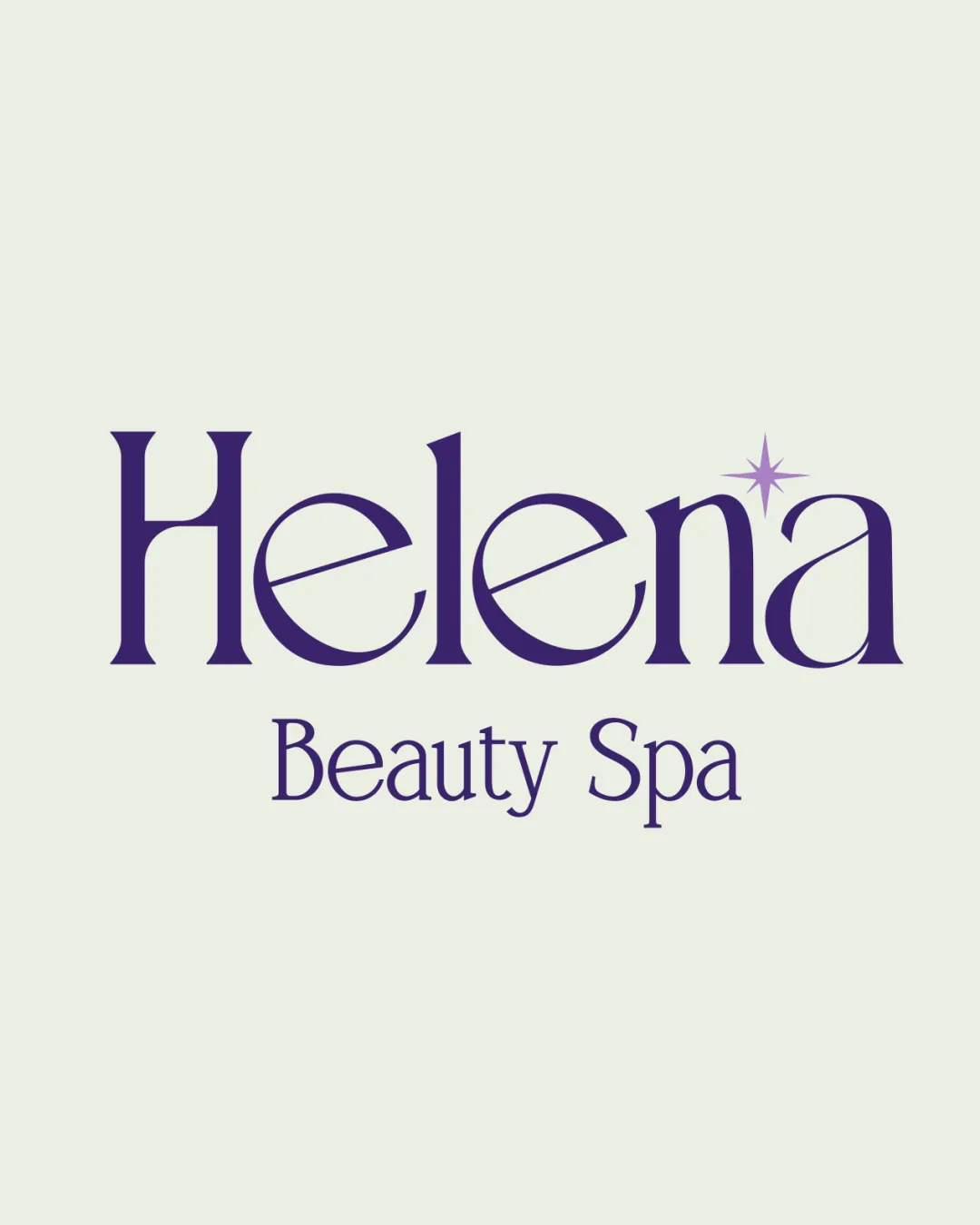
Try it Now!Logo review of Helena Beauty Spa
 Logo analysis by AI
Logo type:
Style:
Detected symbol:
Detected text:
Business industry:
Review requested by Haznajims
**If AI can recognize or misinterpret it, so can people.
Structured logo review
Legibility
![]() Text is clean and highly readable
Text is clean and highly readable![]() Letter spacing and weight contribute to clarity
Letter spacing and weight contribute to clarity
Scalability versatility
![]() Simple wordmark translates well to multiple sizes
Simple wordmark translates well to multiple sizes![]() Stylized sparkle graphic is minimal and will reproduce well in print and small applications
Stylized sparkle graphic is minimal and will reproduce well in print and small applications
![]() Thin lines in the serif font and the star detail may lose clarity at very small sizes, e.g., embroidery or small social media icons
Thin lines in the serif font and the star detail may lose clarity at very small sizes, e.g., embroidery or small social media icons
200x250 px
100×125 px
50×62 px
Balance alignment
![]() The word ‘Helena’ is visually balanced with the spark accent
The word ‘Helena’ is visually balanced with the spark accent![]() Secondary phrase 'Beauty Spa' is centered and proportional
Secondary phrase 'Beauty Spa' is centered and proportional
![]() Sparkle accent slightly disrupts horizontal alignment, but this is subtle and may be intentional
Sparkle accent slightly disrupts horizontal alignment, but this is subtle and may be intentional

Originality
![]() Addition of the sparkle adds a signature touch connected to beauty/spa brands
Addition of the sparkle adds a signature touch connected to beauty/spa brands
![]() Concept of a serif wordmark with a sparkle is widely used in the industry
Concept of a serif wordmark with a sparkle is widely used in the industry![]() Letterforms, though elegant, are not unique—no customized touches in letter shaping
Letterforms, though elegant, are not unique—no customized touches in letter shaping
Logomark wordmark fit
![]() Sparkle accent is integrated naturally with the letter 'n'
Sparkle accent is integrated naturally with the letter 'n'![]() Consistent style between wordmark and small decorative element
Consistent style between wordmark and small decorative element
![]() Sparkle could be rendered in a slightly bolder way to prevent disappearing at small sizes, which could affect cohesion
Sparkle could be rendered in a slightly bolder way to prevent disappearing at small sizes, which could affect cohesion
Aesthetic look
![]() Design is classy and visually appealing
Design is classy and visually appealing![]() Color palette is harmonious and suitable for a beauty brand
Color palette is harmonious and suitable for a beauty brand
![]() Lacks distinctiveness due to conventional type and graphic
Lacks distinctiveness due to conventional type and graphic
Dual meaning and misinterpretations
![]() No inappropriate or accidental imagery is present
No inappropriate or accidental imagery is present
Color harmony
![]() Sophisticated color scheme—purple conveys luxury and calmness, background aids legibility
Sophisticated color scheme—purple conveys luxury and calmness, background aids legibility![]() No clashing or excessive use of color
No clashing or excessive use of color
Vivid Violet
#41297A
Pale Gray
#F3F4E6