 View review
Logo score
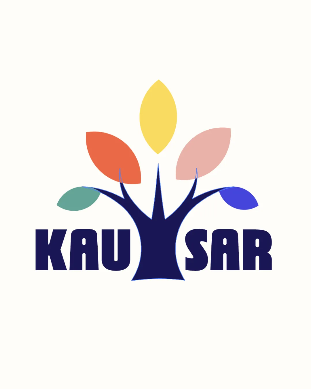
Logo review ofKausar
Review the detailed scores below to see what is working and what should be refined first.
Legibility
Originality
Misread
Balance
Scale
Detailed review
Logo performance breakdown
Legibility
![]() Bold sans-serif font ensures strong readability.
Bold sans-serif font ensures strong readability.![]() Letter spacing is adequate for quick recognition.
Letter spacing is adequate for quick recognition.
![]() The stylized font is a bit blocky, which could hinder legibility at very small sizes.
The stylized font is a bit blocky, which could hinder legibility at very small sizes.![]() Text may lose clarity against some patterned backgrounds due to its thickness.
Text may lose clarity against some patterned backgrounds due to its thickness.
Originality
![]() Leaf colors add personality and a playful touch.
Leaf colors add personality and a playful touch.![]() The combination of bold type and organic tree shape is a pleasant contrast.
The combination of bold type and organic tree shape is a pleasant contrast.
![]() Tree and leaf motifs are widely used and feel generic for the education or growth sectors.
Tree and leaf motifs are widely used and feel generic for the education or growth sectors.![]() No notable use of negative space or unique symbol integration.
No notable use of negative space or unique symbol integration.
Color harmony
![]() Colors are harmonious and feel friendly, not clashing.
Colors are harmonious and feel friendly, not clashing.![]() Palette is diverse but maintains a visual rhythm.
Palette is diverse but maintains a visual rhythm.
![]() Using five distinct colors borders on excessive and risks complicating brand application.
Using five distinct colors borders on excessive and risks complicating brand application.![]() Color consistency may be challenging across different reproduction methods and backgrounds.
Color consistency may be challenging across different reproduction methods and backgrounds.
Space
#11194C
Dandelion
#F9E566
Flame
#EA6044
Melon
#E8B8B5
Puerto
#48AC98
Royal
#3654D6
Color may be holding this logo back. Explore stronger palette options with Colorfly.design before updating the logo.
Explore palettesBalance alignment
![]() The tree is visually centered above the wordmark, creating a strong vertical alignment.
The tree is visually centered above the wordmark, creating a strong vertical alignment.![]() Symmetrical design gives a stable appearance.
Symmetrical design gives a stable appearance.
![]() The bottom trunk line doesn't align perfectly with the 'KAUSAR' letter baseline, creating mild visual dissonance.
The bottom trunk line doesn't align perfectly with the 'KAUSAR' letter baseline, creating mild visual dissonance.![]() Leaf arrangement feels slightly heavy to the left which makes the composition less balanced.
Leaf arrangement feels slightly heavy to the left which makes the composition less balanced.

Scalability
![]() Bold lines and large shapes translate well to larger formats like banners or signage.
Bold lines and large shapes translate well to larger formats like banners or signage.![]() The icon can work independently of the text when needed.
The icon can work independently of the text when needed.
![]() Fine points in the tree branches may lose clarity at very small sizes or low-res printing.
Fine points in the tree branches may lose clarity at very small sizes or low-res printing.![]() Multiple colors are harder to reproduce in certain media like embroidery, and gradients will not display well on all materials.
Multiple colors are harder to reproduce in certain media like embroidery, and gradients will not display well on all materials.
200x250 px
100×125 px
50×62 px
Misinterpretations
![]() No unintended negative symbolism detected.
No unintended negative symbolism detected.![]() Represents positive themes: growth, diversity, community.
Represents positive themes: growth, diversity, community.
Symbol & text fit
![]() Color tie-in between tree and text helps unify the mark and wordmark.
Color tie-in between tree and text helps unify the mark and wordmark.
![]() Both components have a similar visual weight.
Both components have a similar visual weight.
![]() The organic curves of the tree and the geometric solidity of the type are slightly mismatched stylistically.
The organic curves of the tree and the geometric solidity of the type are slightly mismatched stylistically.
![]() The junction between the trunk and the wordmark feels abrupt rather than seamlessly integrated.
The junction between the trunk and the wordmark feels abrupt rather than seamlessly integrated.
Try your own review
Review my logo
Wondering how your logo performs?
Get a clear logo score, key risks, and priority fix ideas before your client or audience sees it.
Keep exploring


