Wondering how your logo performs? 🧐
Get professional logo reviews in seconds and catch design issues in time.
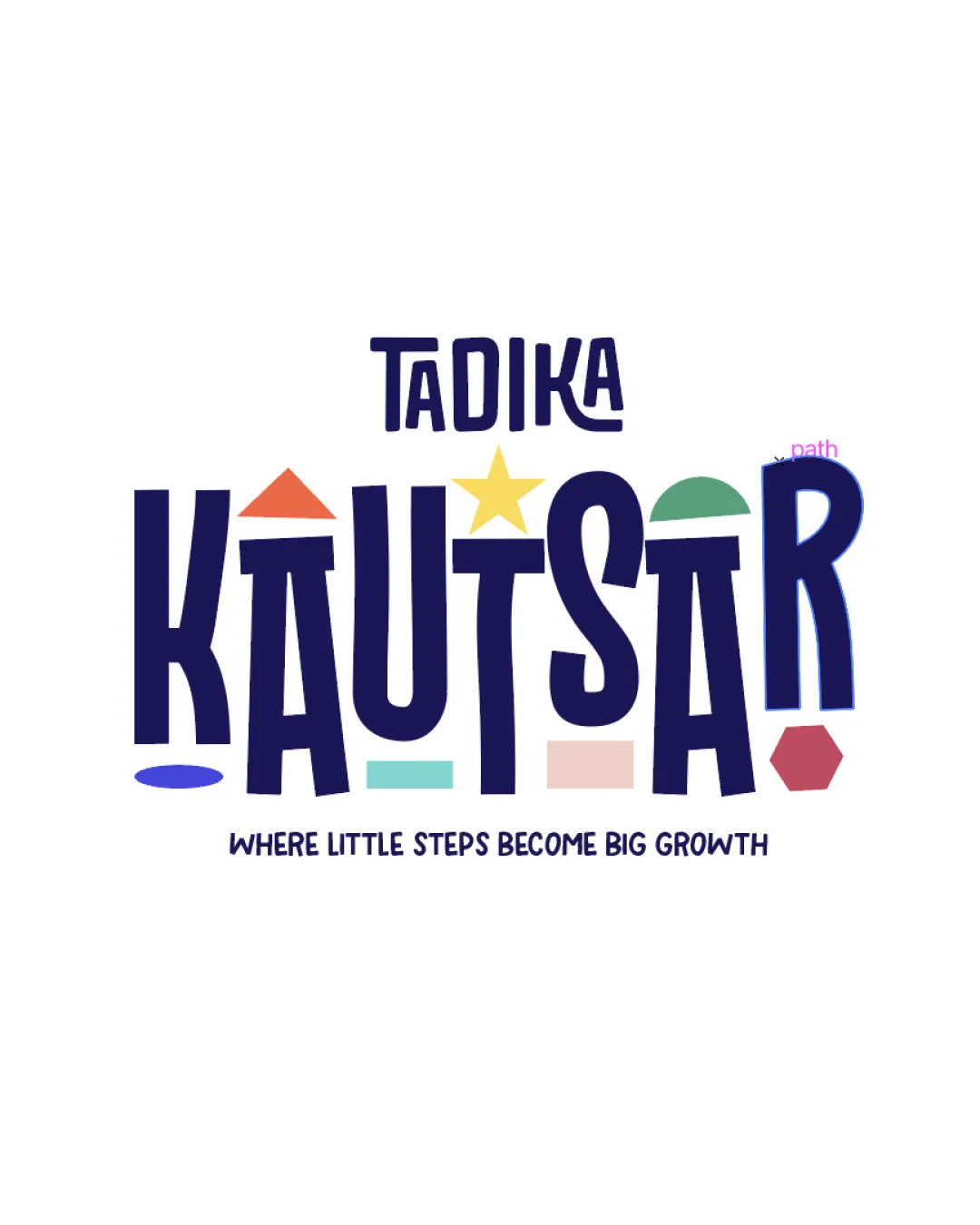
Try it Now!Logo review of TADIKA KAUTSAR WHERE LITTLE STEPS BECOME BIG GROWT..
 Logo analysis by AI
Logo type:
Style:
Detected symbol:
Negative space:
Detected text:
Business industry:
Review requested by Haznajims
**If AI can recognize or misinterpret it, so can people.
Structured logo review
Legibility
![]() Primary text 'KAUTSAR' is bold and clear.
Primary text 'KAUTSAR' is bold and clear.![]() Secondary tagline is readable, even at smaller sizes.
Secondary tagline is readable, even at smaller sizes.
![]() Decorative shapes slightly distract from character recognition.
Decorative shapes slightly distract from character recognition.![]() Letter 'R' at the end could be misread due to overlapping elements.
Letter 'R' at the end could be misread due to overlapping elements.
Scalability versatility
![]() Bold lines and strong text provide clarity at medium-large sizes.
Bold lines and strong text provide clarity at medium-large sizes.![]() Vibrant shapes would stand out on signage and classroom décor.
Vibrant shapes would stand out on signage and classroom décor.
![]() Thin lines within shapes may be lost at small sizes.
Thin lines within shapes may be lost at small sizes.![]() Logo becomes cluttered and loses impact as a small icon or embroidery.
Logo becomes cluttered and loses impact as a small icon or embroidery.![]() Too many color blocks and small elements reduce visual clarity on miniature applications (e.g., business cards, favicons).
Too many color blocks and small elements reduce visual clarity on miniature applications (e.g., business cards, favicons).
200x250 px
100×125 px
50×62 px
Balance alignment
![]() Vertical stacking creates a playful visual hierarchy.
Vertical stacking creates a playful visual hierarchy.![]() Geometric shapes break monotony and inject whimsy, fitting the industry.
Geometric shapes break monotony and inject whimsy, fitting the industry.
![]() Logo feels slightly top-heavy due to concentration of shapes above letters.
Logo feels slightly top-heavy due to concentration of shapes above letters.![]() Some shapes (notably above 'U' and 'S') create minor misalignment, disrupting flow.
Some shapes (notably above 'U' and 'S') create minor misalignment, disrupting flow.

Originality
![]() Integration of varied educational shapes is unique and on-brand for early learning.
Integration of varied educational shapes is unique and on-brand for early learning.![]() Playful type treatment stands out from typical educational logos.
Playful type treatment stands out from typical educational logos.
![]() Shapes are common educational motifs, reducing true uniqueness.
Shapes are common educational motifs, reducing true uniqueness.![]() No symbolic negative space utilization.
No symbolic negative space utilization.
Aesthetic look
![]() Vibrant, kid-friendly palette exudes energy and warmth.
Vibrant, kid-friendly palette exudes energy and warmth.![]() Composition is lively and engaging—suitable for the target audience.
Composition is lively and engaging—suitable for the target audience.
![]() Multiple mixed colors may limit application across various backgrounds.
Multiple mixed colors may limit application across various backgrounds.![]() Slightly crowded appearance from overlapping shapes and text.
Slightly crowded appearance from overlapping shapes and text.
Dual meaning and misinterpretations
![]() No visible inappropriate symbols or problematic visual forms.
No visible inappropriate symbols or problematic visual forms.![]() Shapes clearly evoke an educational, playful theme.
Shapes clearly evoke an educational, playful theme.
Color harmony
![]() Palette is cheerful and inviting.
Palette is cheerful and inviting.![]() Colors are distinct, aiding in playful segmentation.
Colors are distinct, aiding in playful segmentation.
![]() Palette exceeds four main colors, risking visual overload.
Palette exceeds four main colors, risking visual overload.![]() Potential clutter when used on colored backgrounds or in grayscale.
Potential clutter when used on colored backgrounds or in grayscale.
Deep Blue
#22265D
Light Orange
#FF6F4A
Yellow
#F1C975
Teal
#5FC0BB
Pale Beige
#E3C9B0
Red
#E25E66
Light Green
#7DDBB6


