 WRD
Brand design,
made transparent
Discover brand design and connect with its creators.






Community projects

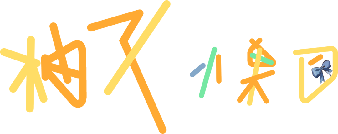
2.8/5Logo score
柚又小果団
A lively, original, and playful wordmark that successfully conveys a youthful personal brand, but requires clarity and scaling optimization to function well on digital platforms.
#CDB5B4
#2F4356
#C9BCD9
Lady Manitra Core Palette
A gentle, sophisticated palette of powder pink and deep blue for a delicate perfume brand, balanced by soft lavender and muted taupe neutrals for a lightweight, calming sensorial…
#283D19
#C6A345
#D62717
#996515
Bohemian Tuscany
Balanced heritage palette reflecting Czech brewing legacy and Tuscan terroir, with rich green and gold offset by robust terracotta and complementary neutrals for digital and print…
#6B39F4
#4B22B8
#B7A9F0
#DDD6FF
Color Palette generator by AI
Build strategic brand color palettes where every color has a purpose. Describe your brand, audience, and creative direction, and AI turns them into a complete palette in seconds.…
#B5FF23
#2B303A
#6A7A95
MBA101 AI Marketing
A bold, energetic palette leveraging electric yellow-green for standout recognition, balanced by deep blue-black and clean white for clarity. Subtle blue-grey support increases…
#6B39F4
#4B22B8
#B7A9F0
#DDD6FF
Color Palette generator by AI
Build strategic brand color palettes where every color has a purpose. Describe your brand, audience, and creative direction, and AI turns them into a complete palette in seconds.…

3.7/5Logo score
InfiniteCapital
A modern, professional logo with a well-structured abstract mark and clear wordmark, slightly held back by an imbalance between component weights and somewhat generic iconography.
#971B28
#A98C64
#487046
#B46F3C
Valpolicella Estate
Inspired by Valpolicella landscapes and the winery's distinctive red shutters, this palette blends rich reds, warm stone tones, and natural green, creating a wine-centered yet…
#6B39F4
#4B22B8
#B7A9F0
#DDD6FF
Color Palette generator by AI
Build strategic brand color palettes where every color has a purpose. Describe your brand, audience, and creative direction, and AI turns them into a complete palette in seconds.…

AUBE PROFESSIONAL
A refined, upscale logo with strong professional presence and visual harmony; overall effective with only minor risks concerning scalability and the artistic 'E'.
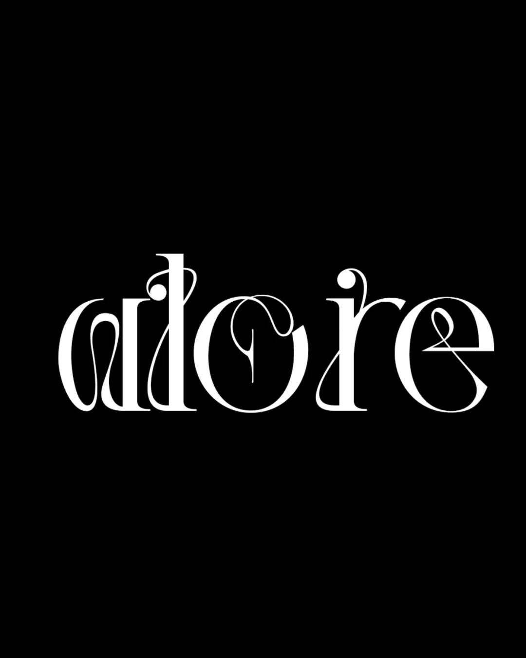
2.8/5Logo score
adore
Visually striking and elegant but functionally compromised as a primary logo due to severe legibility and scalability issues.
#215189
#6C2C7D
#398EC7
DGYP Scotland Blue & Thistle
A dynamic, youthful palette inspired by the depth of Scotland’s blues and the distinctive vibrancy of thistle. Designed for energetic professional connections with strong digital…
#2166B5
#F7B844
#228B72
#368DC9
#F48434
DGYP Modern Energy
A professional, progressive palette inspired by the original logo's blue and gold, refreshed for dynamic, youthful engagement. Offers strong visual hierarchy and accessibility for…
#303C5C
#D0F013
#13A6BA
#D97248
DGYP Energetic Progression
Vivid, upbeat palette with strong contrast, designed for energetic young professionals. Balanced with a crisp light neutral for flexibility and an accessible dark for text. Colors…
#D0F013
#149DB3
#043C44
#EAF6AD
DGYP Dynamic Connect
Bright, energetic palette that emphasizes innovation and fresh connection. High-contrast and youthful, designed for clear digital and print impact while enabling flexible layouts.
#2096D3
#27B6E4
#8ACBE1
DGYP Young Professionals
Fresh, energetic Scottish blues inspired by the Chamber identity, with lively accents and versatile neutrals. Designed for clarity, accessibility, and digital friendliness while…
#D0F013
#0A4438
#B788C9
#5E0054
DGYP Energetic Connection
A vibrant, fresh palette with energetic yellow-green, grounded teal, and modern purple to reflect ambition, innovation, and youthful inclusivity. Balanced by soft, accessible…
3.9/5Logo score
SALENTO.BIKE Sulle strade del cicloturismo in Puglia
An effective, distinctive logo that ties cycling to local culture but should test clarity at small sizes and consider slightly improved mark-wordmark cohesion.
3.2/5Logo score
BOOKIE
Visually inventive, but refinement of the wordmark's construction and mark's line thickness is needed for professional applications.
3.4/5Logo score
BIRYANI SECTION Hits different with every bite
This logo is clear, relevant, and visually appealing for a restaurant/food identity, but the tagline's script style limits hierarchy and readability, making refinement important…
3.6/5Logo score
BIRYANI SECTION Hits different with every bite
Biryani Section logo is visually appealing and communicates its food category well, but the symbol’s fine lines and the tagline require refinement for robust application.

4.1/5Logo score
IGREJA MISSIONÁRIA
A strong, modern institutional logo with healthy alignment and a distinct, relevant symbol, needing only proportion tweaks and scale testing.