 DOD
DOD
Brand design,
made transparent
Discover brand design and connect with its creators.


Public logo reviews
3.4/5Logo score
GLOWCODECO. THE DAILY RESET METHOD
Well-composed and purposeful combination, with moderate distinctiveness and lockup efficiency; main concern is scalability of finer elements.
3.5/5Logo score
ENTREPRISE
A functional, professional business logo with crisp letterforms and modern color use, but moderate originality and cohesion—fine-tuning spacing and exploring more distinct…
3.3/5Logo score
Geometric Minimal Abstract Symmetrical Logo
A balanced abstract mark with high visual symmetry, suitable for versatile use but may need reinforcement of central details for tiny applications.
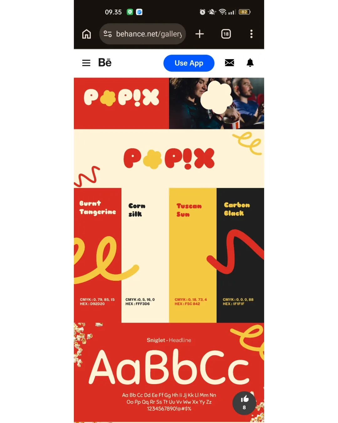
3.9/5Logo score
POP!X
A bold, playful logo suited for a popcorn brand, with high legibility and color appeal; key improvement is kerning for balanced rhythm.

4.1/5Logo score
Cartoon Playful Cartoonish Orange Logo
A striking, inventive logo that joyfully merges a personal initial with a mascot cartoon face, fitting a playful, creative brand identity.

4.4/5Logo score
onilaine
Strong, distinctive wordmark with effective balance and legibility; unique character modification elevates memorability while retaining clarity.
3.7/5Logo score
TERRATOPIA
A visually compelling, highly legible logo with a memorable geometric mark; polish shape proportions for best results.
2.4/5Logo score
HSC
The academic context is clear due to the graduation cap, but heavy stylization of the monogram hinders legibility and visual balance, limiting immediate effectiveness for an…
3.3/5Logo score
NOIRVE
A dynamic, original wordmark that quickly signals boldness and energy, but its extreme stylization and wide spread mean legibility and spatial efficiency should be checked before…

3.2/5Logo score
WD ADVISORY FINANCIAL & MANAGEMENT ADVISORY
The logo communicates stability and expertise with a strong geometric mark and clear hierarchy, but minor text alignment and legibility refinements would enhance scalability and…

3.7/5Logo score
Abstract Minimal Human Figure Logo
A visually harmonious and original abstract symbol suitable for wellness or nature-themed brands, with minor risks at small sizes and slight refinement opportunity for balance.
4/5Logo score
SUKOWA Coffee
A friendly, effective coffee shop logo with minor refinements optional and small size testing advisable.
4/5Logo score
ASSOCIAZIONE AMICI DI RONCO
Distinctive and locally meaningful emblem with excellent legibility and style, but detailed hand-drawn artwork may need adaptation for scalability.
3.8/5Logo score
Mystic Sparkle
A striking, readable, and expressive wordmark that effectively suggests energy and personality, but would benefit from some typographic balance adjustments.
3.3/5Logo score
!deaScape The Growth Strategist
A functional and clear wordmark with creative touches, but improvements to balance and palette cohesion would enhance polish.
3.7/5Logo score
Modern Abstract Arrangement Two Logo
The logo is visually distinctive and appealing, with strong symbolism, balance, and color; verify scalability and versatility in single-color applications.
3.8/5Logo score
Amin Abollhassani
Distinctive and professional logo, with readability and originality strengths; moderate cohesion and balance issues could be refined for an even stronger impact.
4/5Logo score
PULPI DENTAL CARE
Solid, legible and modern logo, but lacks a distinctive playful or friendly accent needed for the 5-30 years target group.
3.3/5Logo score
oft
The logo features a clear, friendly wordmark style but fails to show the full brand and risks generic appearance; full brand inclusion and minor differentiators are needed.
4.3/5Logo score
WebbLyftet
A memorable, clear, and brand-appropriate logo that is visually unified, with most issues minor and related to fine-tuning scalability and balance.
CreativityAwarded by mylogo.reviewAwarded on 9 October 2026Congratulations on creating such an authentic logo! Our team loved its abstract and elegant style, and we wanted to recognize your creativity with this award.
4/5Logo score
SPIRITED HANDS the marketplace for craftsman
A highly original, visually engaging logo that effectively signals creativity and craft, though minor readability and detail scalability issues merit corrective testing.
2.4/5Logo score
phirkini by CH
The logo has elegant typography and overall appeal for a women’s clothing brand, but the proprietary accent mark may cause unintended interpretations, holding back professional…
3.7/5Logo score
United Scouts Association
A strong, unified scouting emblem readily communicates its mission, with only a small risk of fine detail loss when scaled down.
3.7/5Logo score
This is a clear, appealing, and highly functional logo for a payments app, needing only minor tweaks for a stronger sense of unity and distinctive ownership.